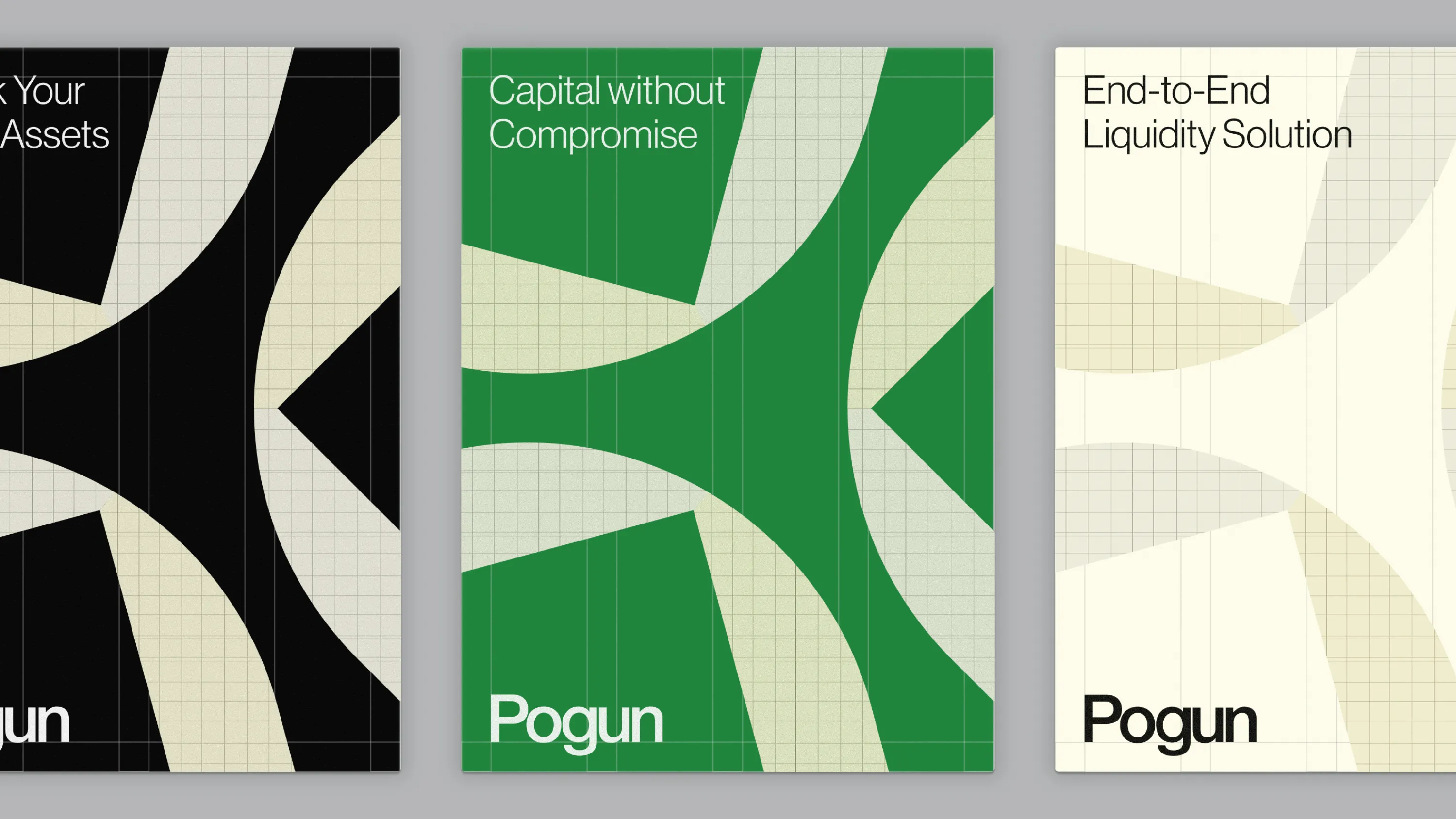
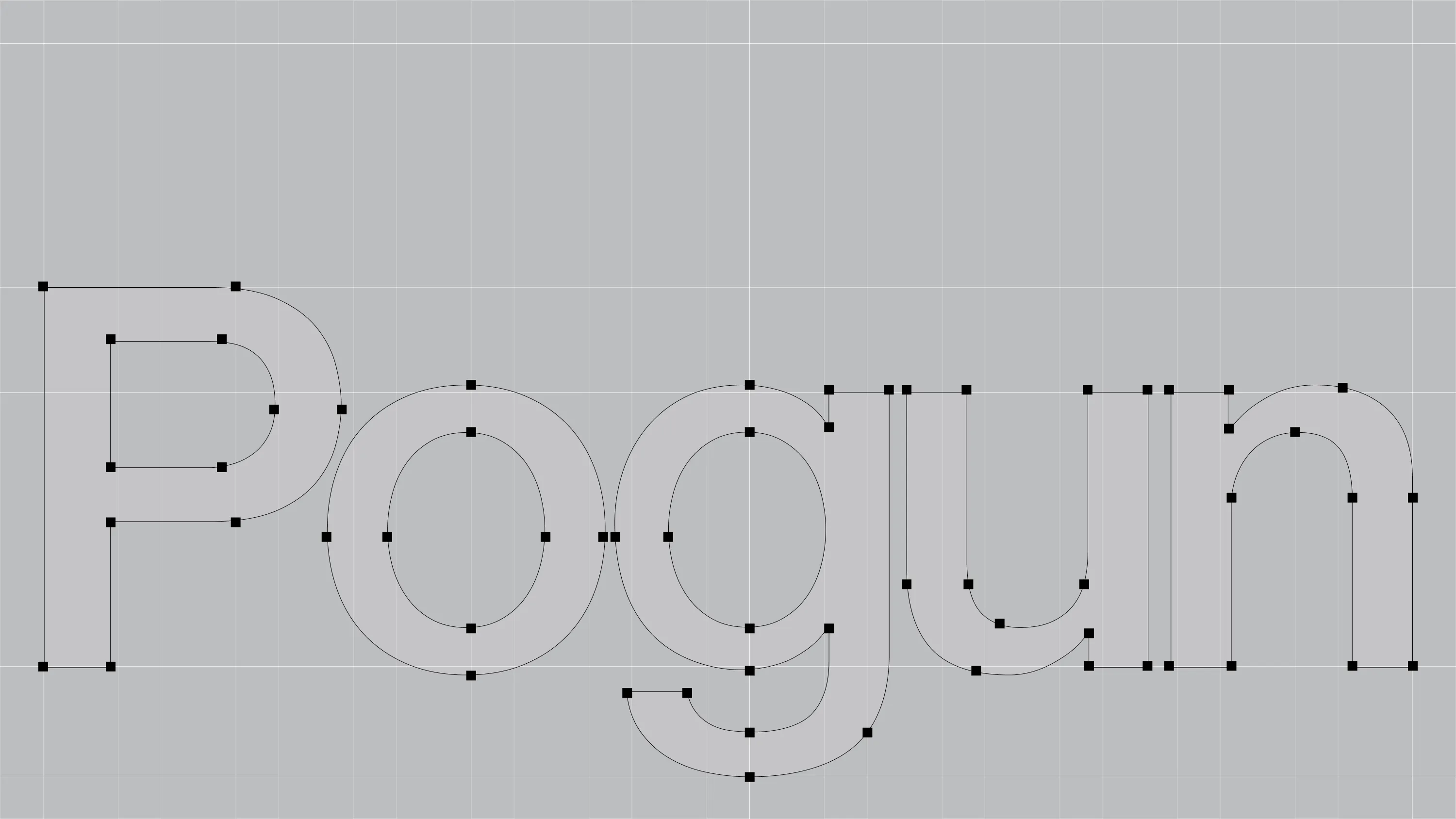
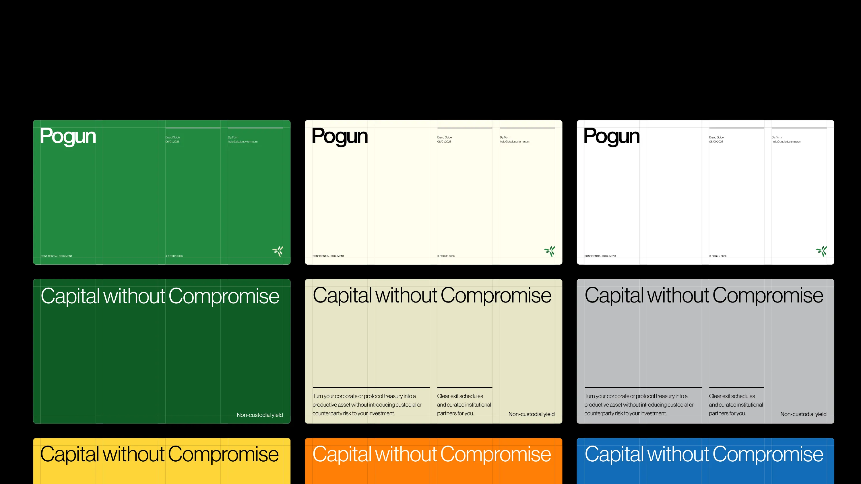
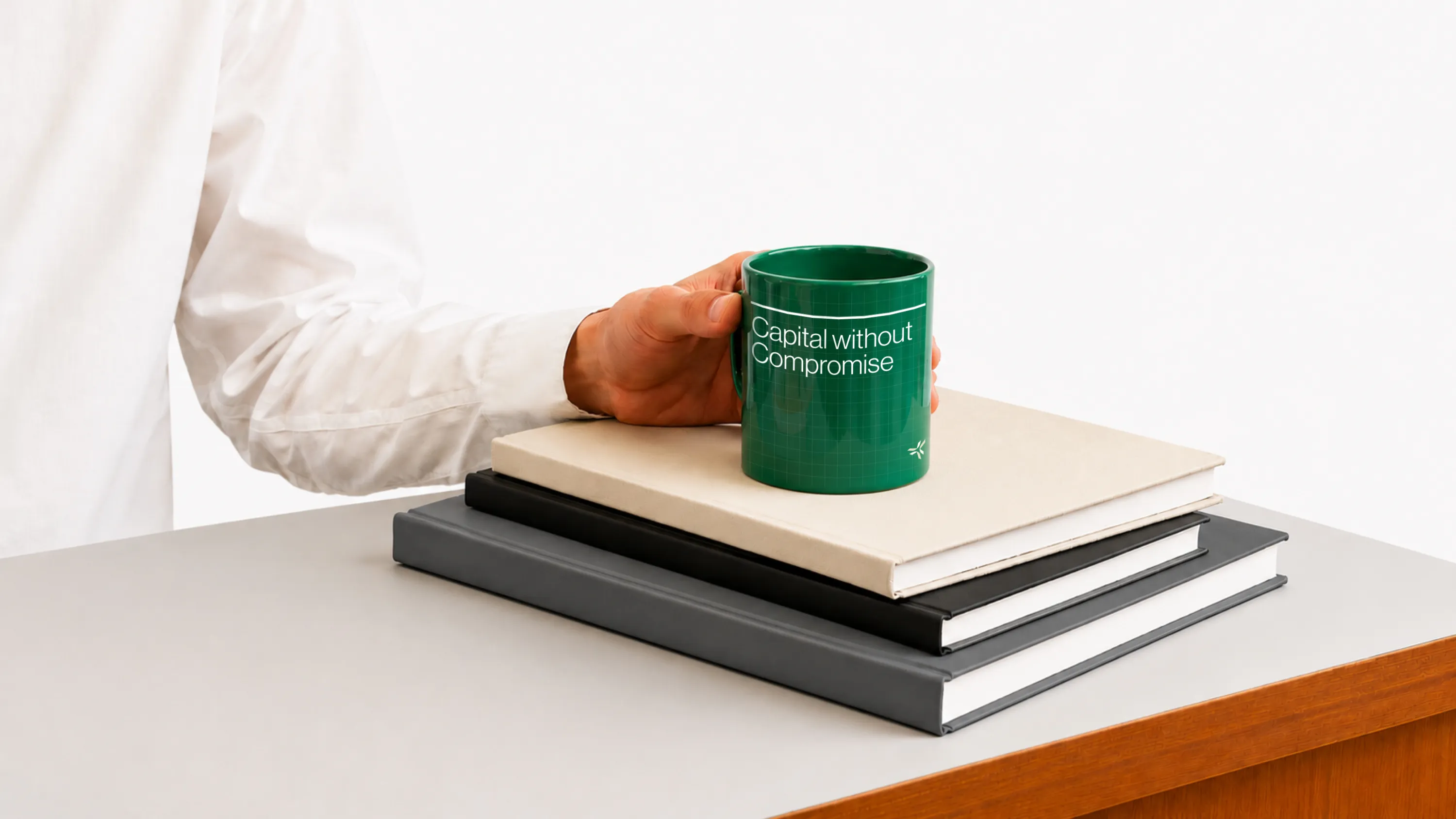
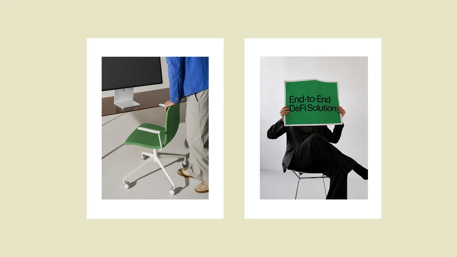
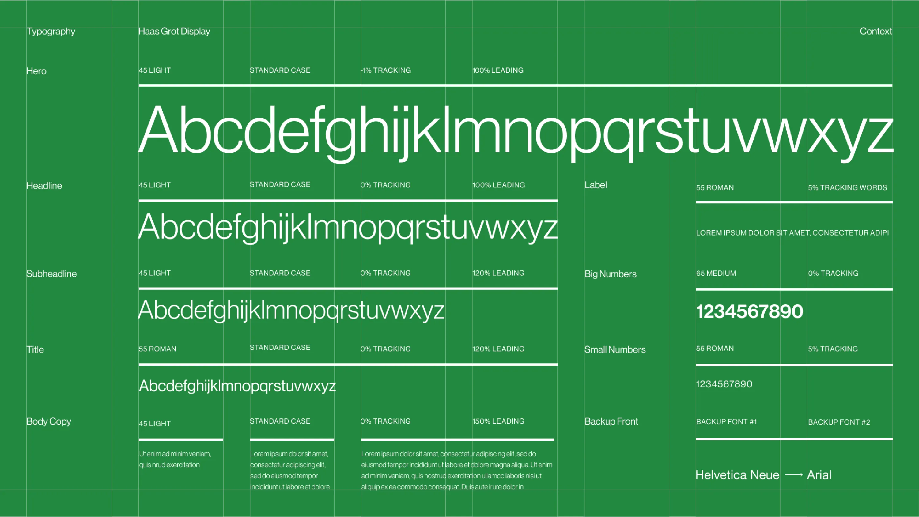
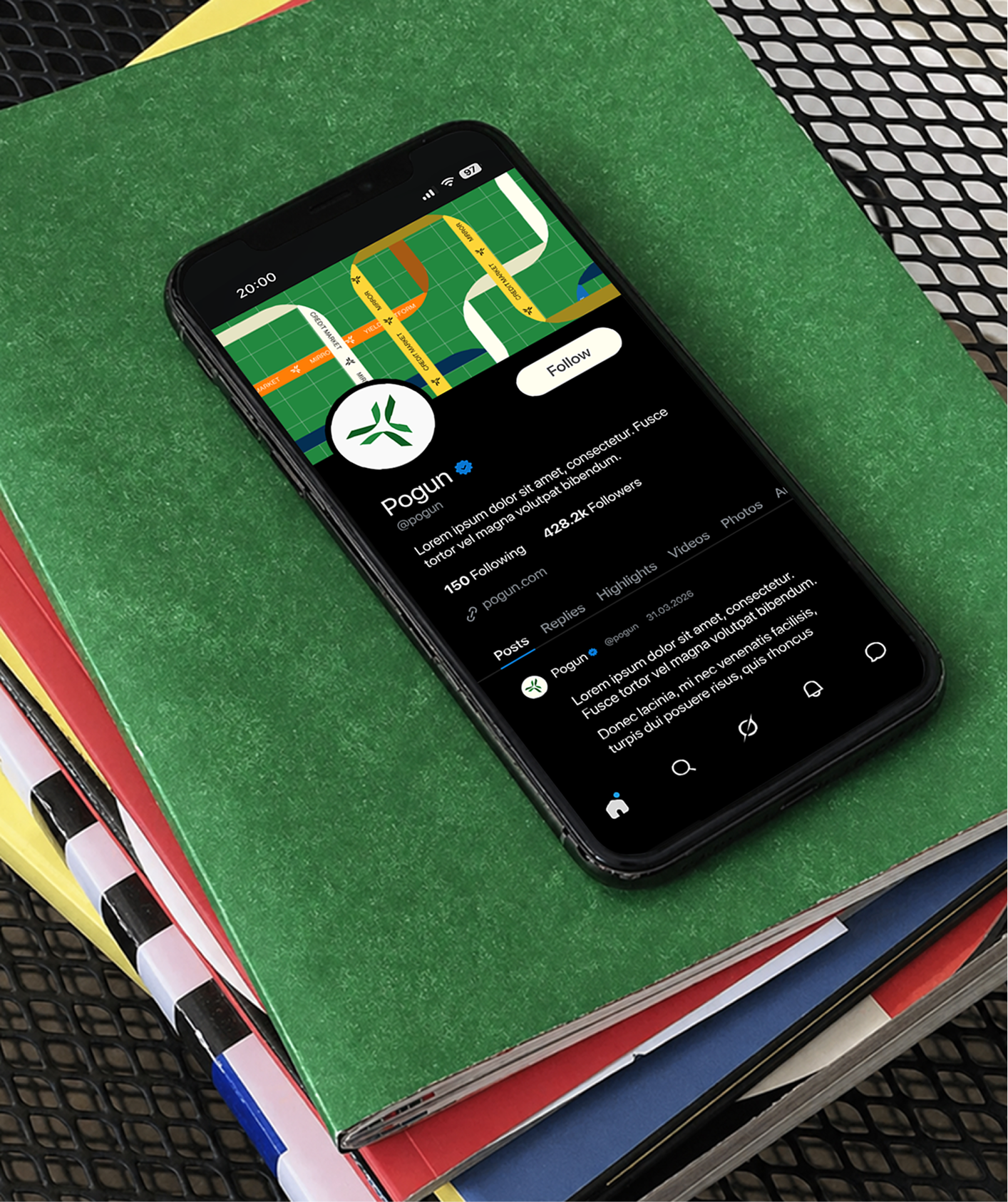
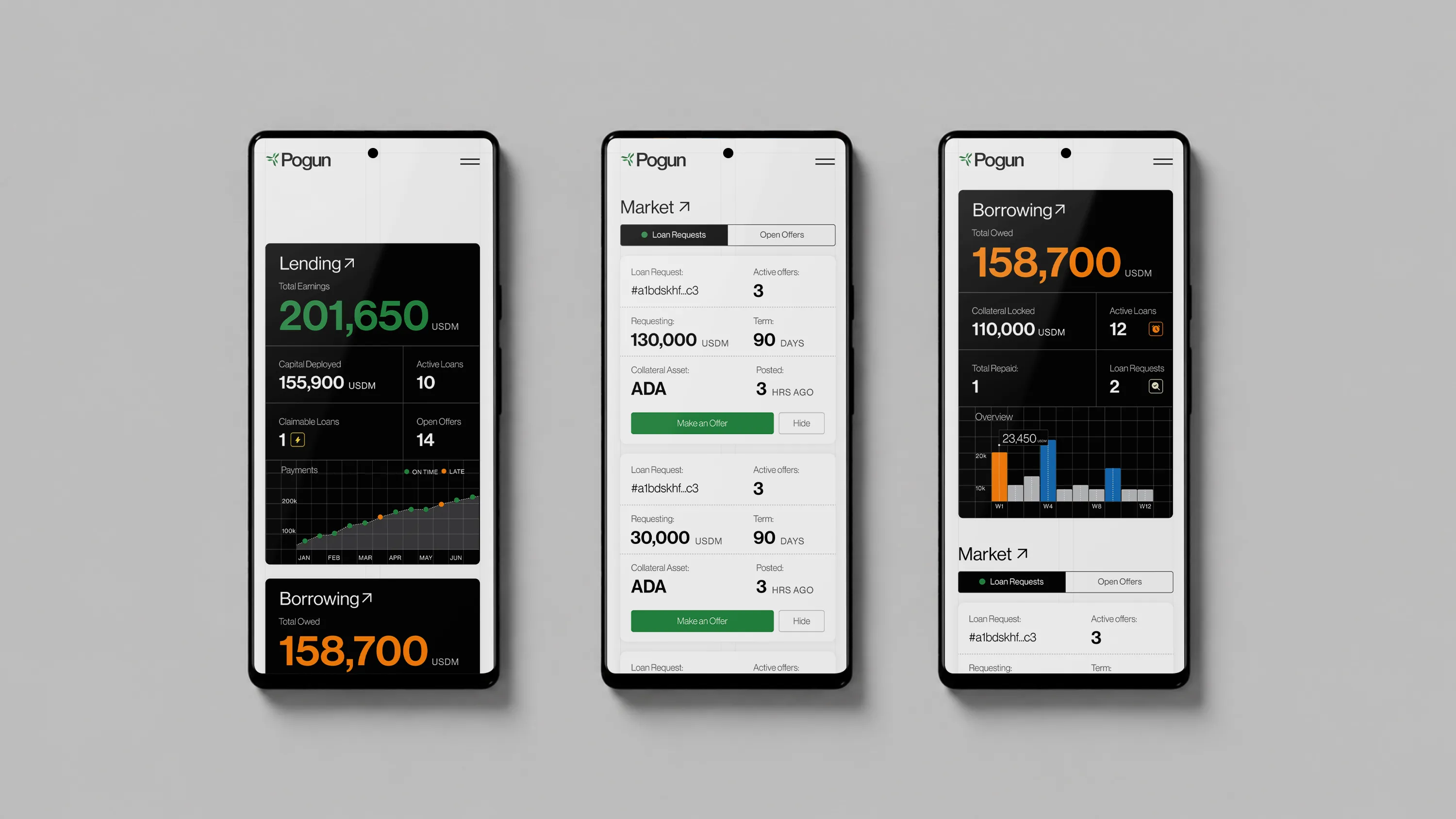
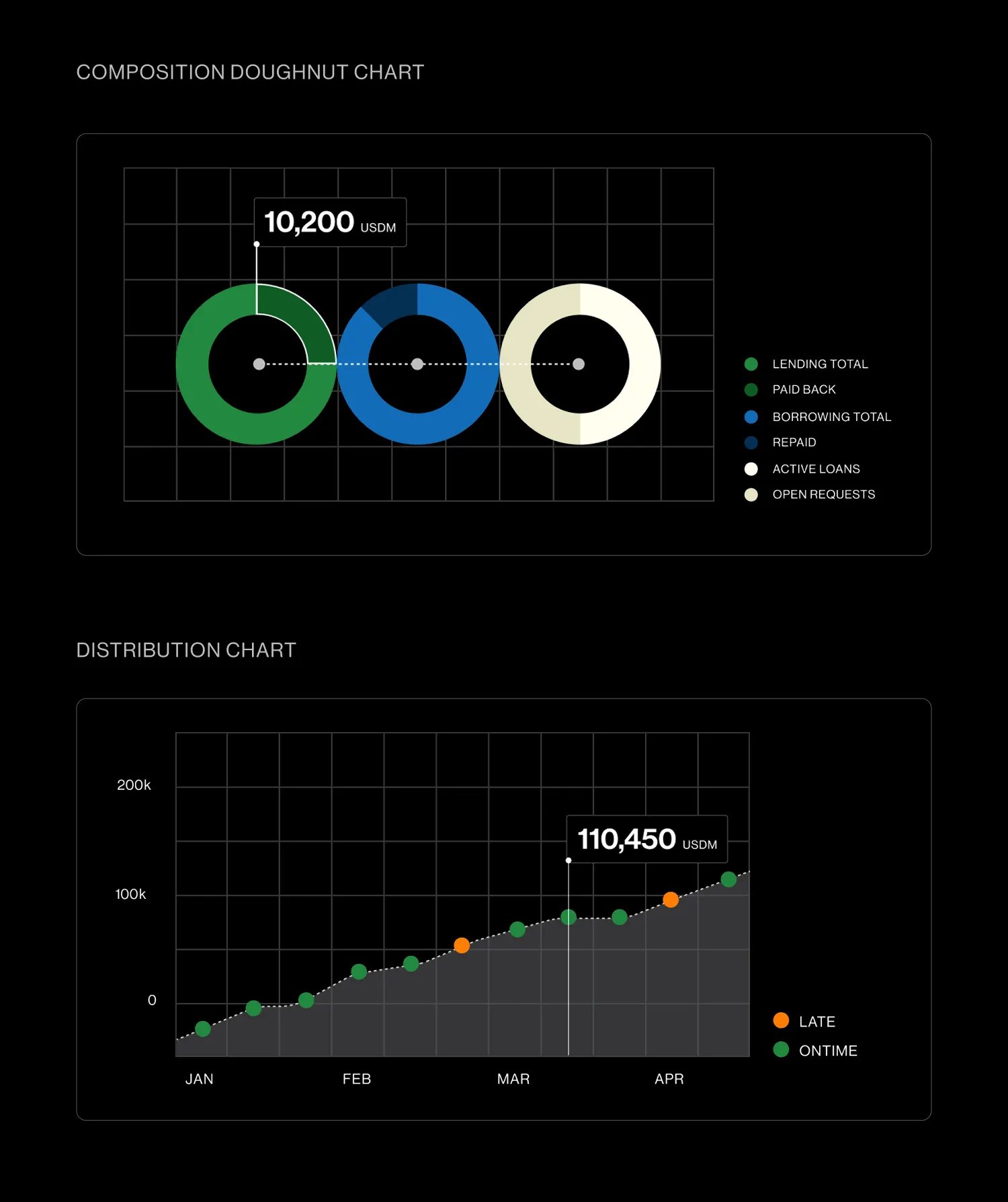
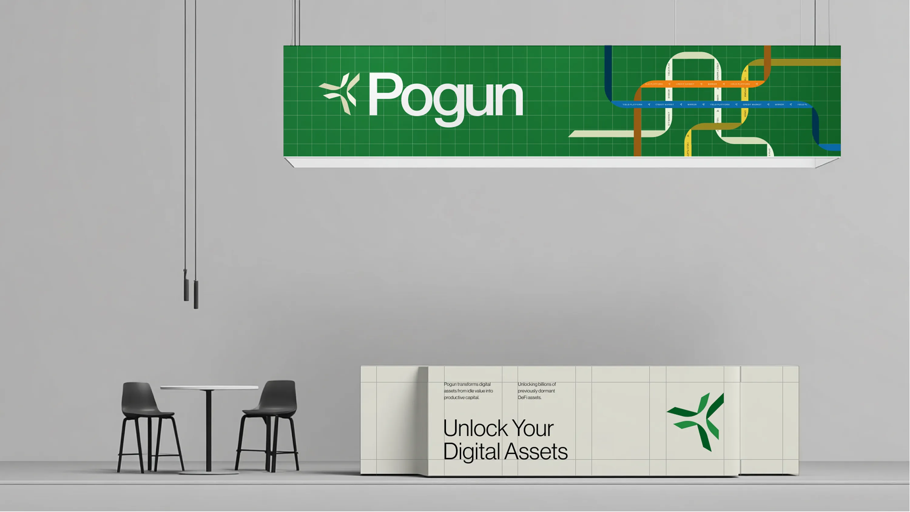
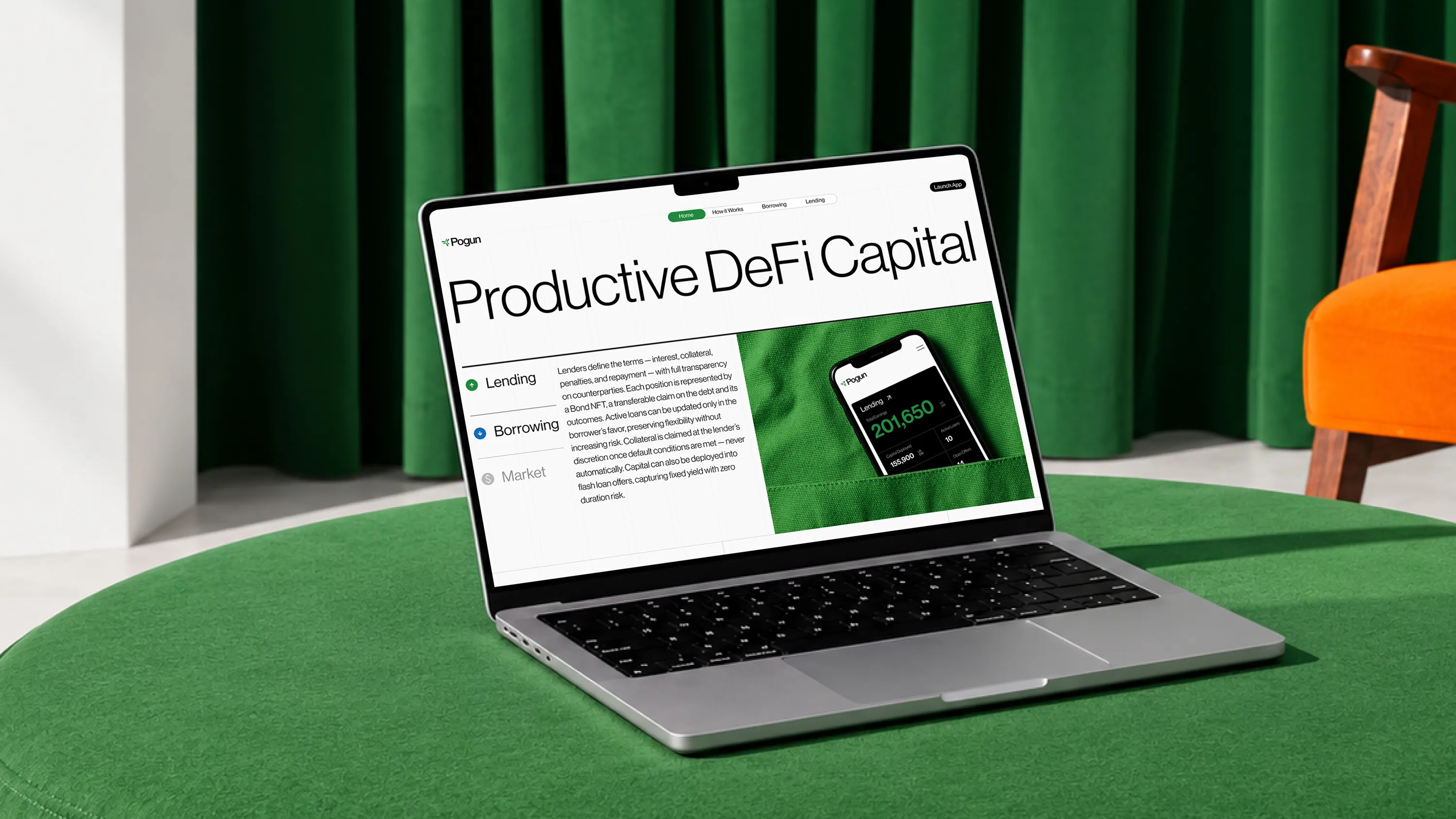
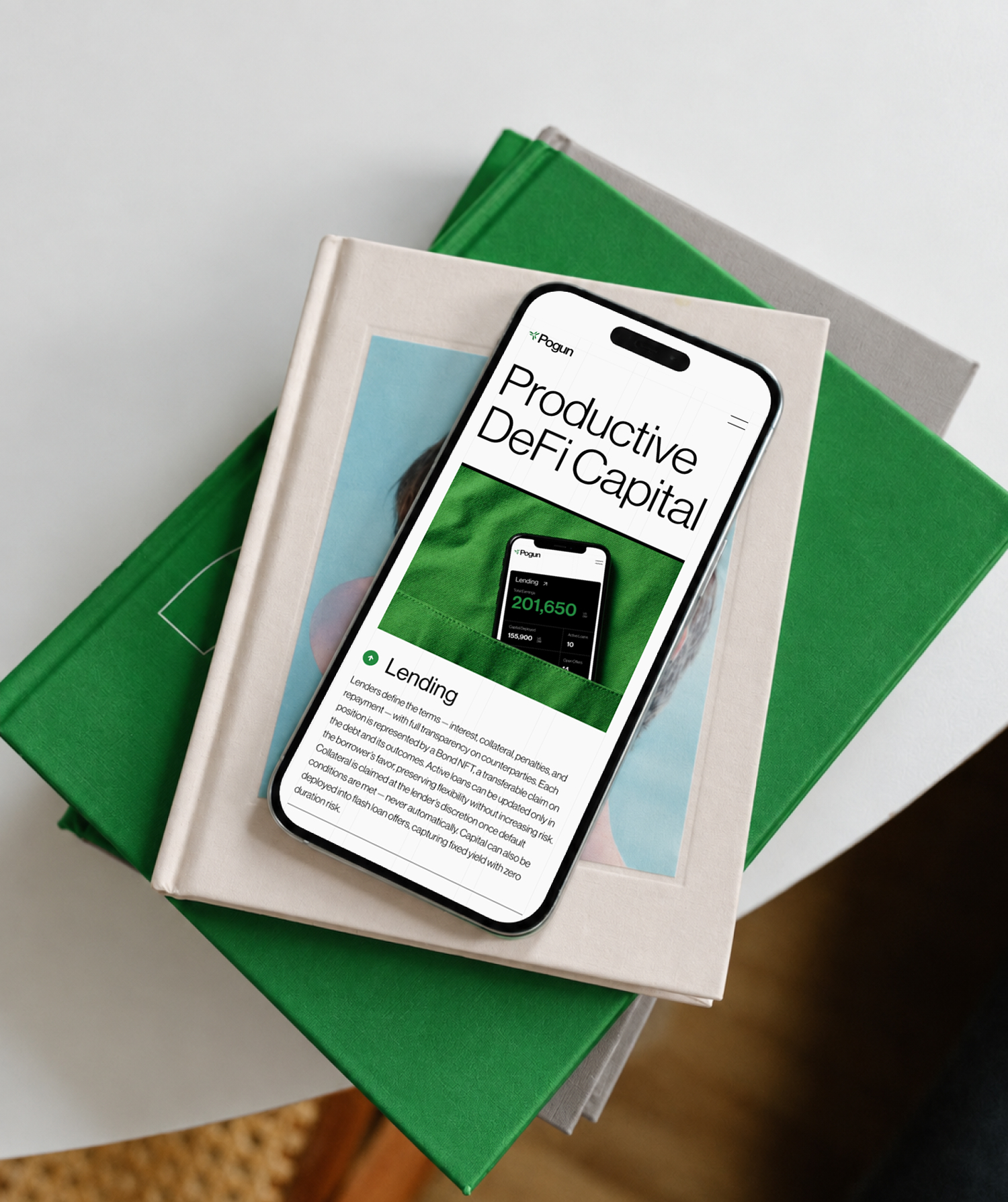
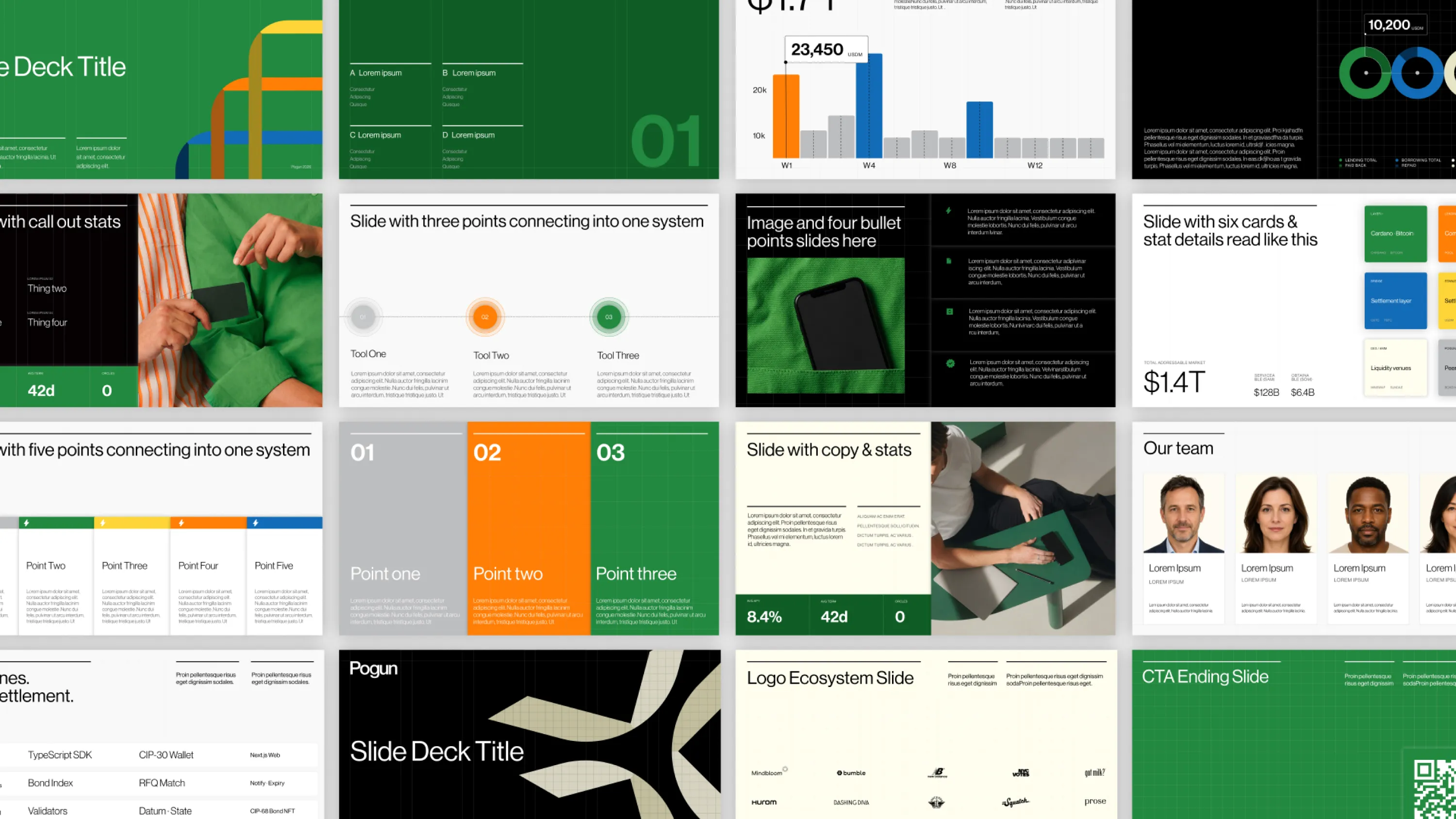
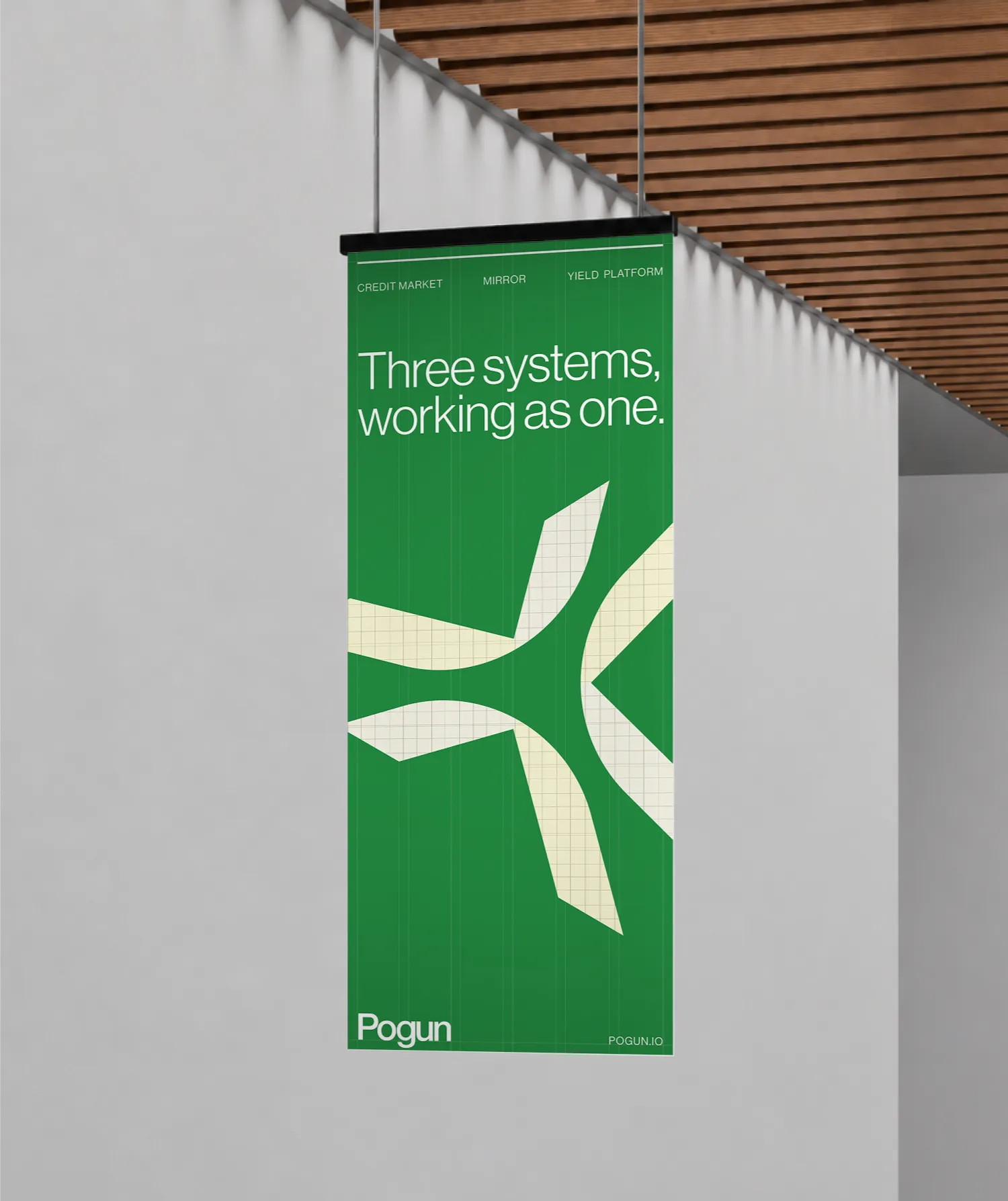
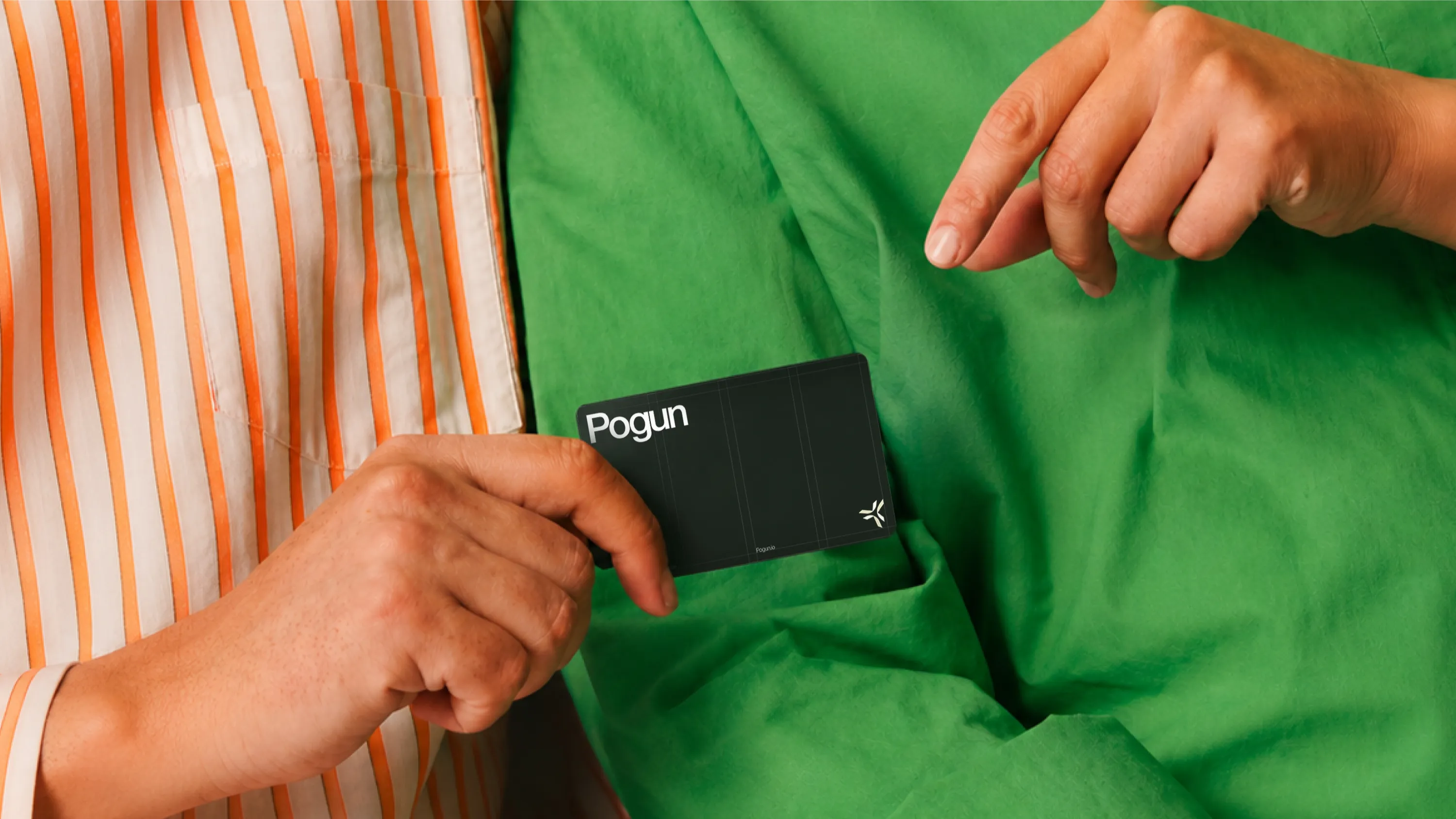
Pogun is unlocking native Bitcoin liquidity for lending, yield, and institutional DeFi without wrapping, custody, or compromising Bitcoin’s security. For institutions and crypto-native users looking to put digital assets to work, the brand identity transforms complex financial infrastructure into a precise, highly structured system — where a single geometric symbol expands into pathways that visualize the movement of capital across the ecosystem.



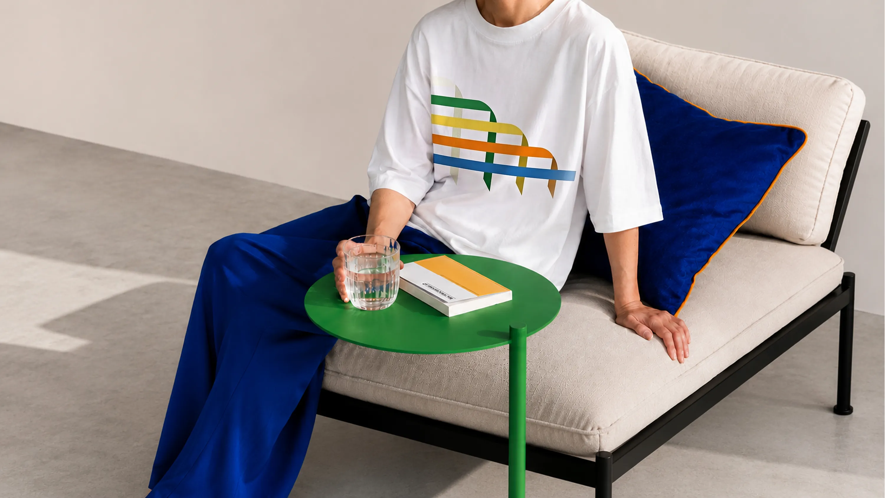





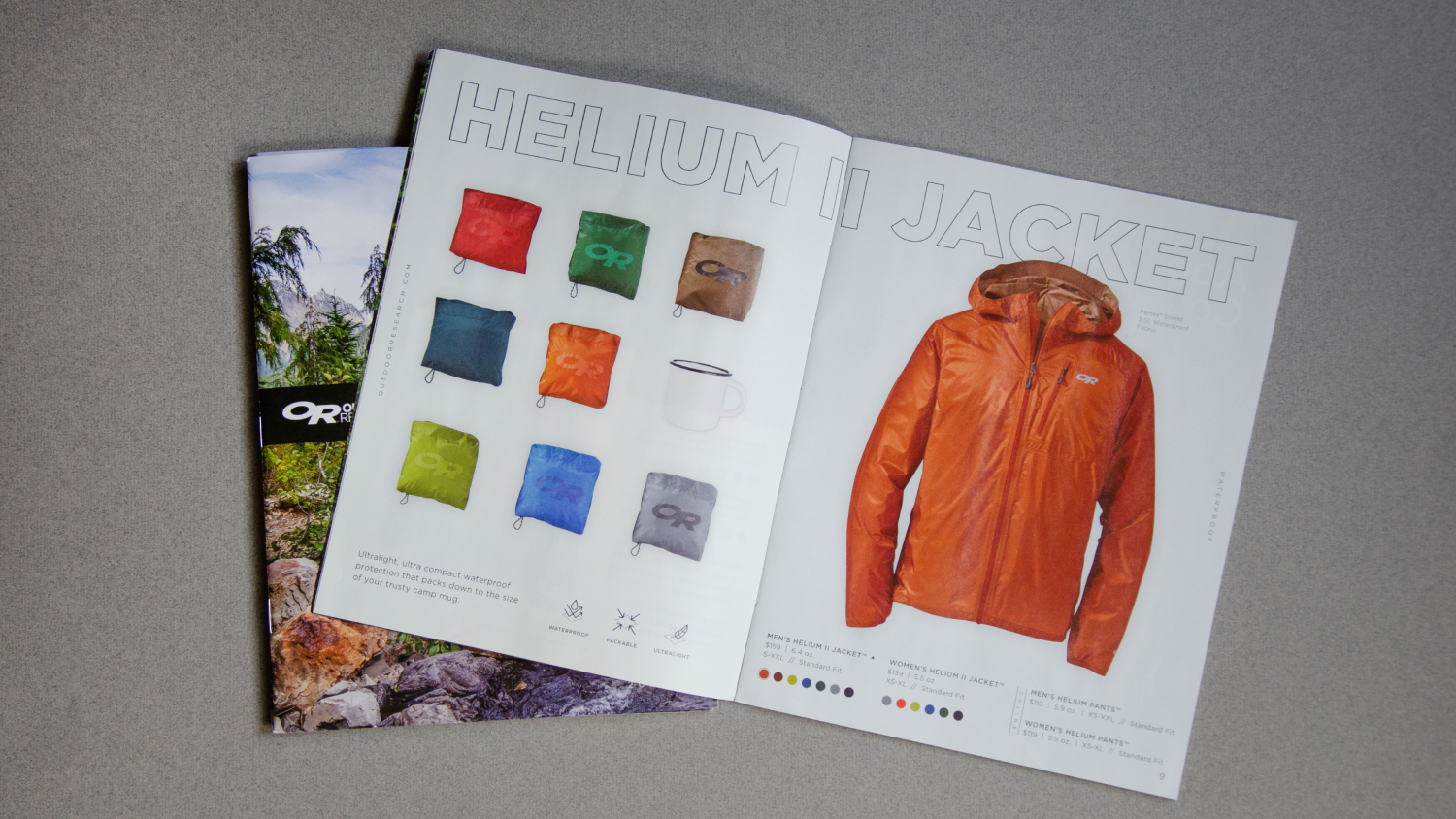
To express the Outdoor Research brand, Form designed the Spring and Fall 2020 catalogs, creating a cohesive editorial system across two seasonal releases.
Frankie & Jo’s is a plant-based ice cream company shifting how people think about ice cream. They are committed to creating unique flavors of creamy and delicious vegan ice cream using only trees and plants. The identity uses warm and creamy colors to bring sunshine to Seattleites and convey the taste of the ice cream. The identity also uses custom illustrations to highlight the plant-based production method.

Actiontec develops broadband solutions that connect people to the Internet, applications, and content they care about. Their products include: routers, modems, high-speed gateways, wireless networking solutions, and wireless display solutions deployed by some of the largest service providers in North America. The identity expression is a traditional take on a modern service, balancing bold simplicity with technical detail.

Light Sleeper is a natural wine bar based in the heart of Capitol Hill, in Seattle. The bar offers terroir representative - natural wines, wine-based cocktails, and food that goes with wine. The identity of the bar speaks to Seattleites and tourists by bringing in an alternative and lively perspective to the world of wine through the blend of the graphics and art direction.

Postcard from the Badlands is a four-member new music ensemble that explores the intersection of Americana, modern chamber music, and instrumental rock. The ensemble creates layered and dusty sonic landscapes inspired by excellent film music's tension, melancholy, and elation. The album artwork reflects the audio tale from a song-by-song perspective to create an abstract representation of the sonic, visual landscape the album weaves.

Living Wine is a film following the journeys of natural winemakers in Northern California during the largest wildfire season on record. To express the film's character and connect with conscious consumers, we built a minimal yet textured visual identity and a responsive website that leads with the film's content.
.jpg)
51’-0” hand-painted mural in Amazon's new offices on 9th & Thomas in Seattle's SLU neighborhood. The mural's narrative tells a story in the form of a tapestry, made of natural and geometric shapes, woven together to signify Seattle’s ever-changing landscape and a city marked by rapid growth. Environment and structure converge on a journey towards compact urban density coalescing at the center where they break from their linear constructs and the borders that once contained them. This represents a force that cannot be controlled, with infinite and undetermined paths forward.

Lagrange is revolutionizing blockchain scalability with zero-knowledge proofs, enabling seamless, trustless data verification across networks. Their breakthrough technology empowers developers to build more efficient, interoperable decentralized applications. For these innovators, Form crafted a brand identity system, a web presence, printed & digital marketing materials that blend precision with fluidity. A light, airy color palette anchors the visuals with gradients symbolizing the frictionless flow of blockchain data. Network-inspired motifs evoke connectivity and expansion, positioning Lagrange as a leader in decentralized infrastructure.

Shepley Bulfinch: 150 Years is an exhibit experience celebrating a century and a half of architectural innovation. Designed in partnership with Wide Eyed Studio and hosted at the McCormick Gallery in the Boston Architectural College, the installation is intended to engage a broad audience, including architects, students, alumni, and the curious public alike. The exhibits visual identity honors the firm’s legacy while casting a bold eye toward its future. Grounded but not static, the design blends historical reverence with forward-thinking optimism. It reflects an architecture firm that has continually evolved, never stuck in the past and never afraid to shape what comes next.

The Volunteer Park Conservatory (VP|C) is Seattle's historic botanical garden and a horticultural learning center, established in 1912. The Conservatory's rebrand is inspired by the iconic windows of VP|C's greenhouse as well as themes of growth and education.

Cabin Health is a software platform that assists coaches and physical therapists in launching their own fitness program for people suffering from chronic diseases like Parkinson's. The brand's identity is created to be active and engaging for coaches while also being supportive and uplifting for trainees.

RISC Zero is revolutionizing the internet by creating the infrastructure & tooling necessary for Web3 developers around the globe to build zero-knowledge software. For these digital explorers - the brand identity and website are made with dimension, texture, and dark abstraction, illuminated by a citron yellow beam that focuses and inspires the path toward innovation.

Firewall is redefining blockchain security with AI-powered infrastructure that detects and filters malicious transactions in real time. For founders building at the frontier of DeFi, the brand identity and website embody sleek modern security contrasting with a bitmap pattern inspired by the early days of the internet —set in a world of intelligent light that reveals patterns that were once invisible, guiding builders toward a safer, more transparent Web3.
.png)
Aperture is an innovation tool powered by artificial intelligence. The platform's purpose is to help innovators find valuable opportunities across all disciplines. The identity lives primarily in the digital ether and speaks to a highly innovative customer set. To align with user's intelligent & sensible process, the brand feels polished without being overly posh. It is never stodgy, nor is it typical of a Silicon Valley startup.

Pogun is unlocking native Bitcoin liquidity for lending, yield, and institutional DeFi without wrapping, custody, or compromising Bitcoin’s security. For institutions and crypto-native users looking to put digital assets to work, the brand identity transforms complex financial infrastructure into a precise, highly structured system — where a single geometric symbol expands into pathways that visualize the movement of capital across the ecosystem.